Contents
01 Brand Strategy
ModuFi exists to help people see budgeting as a tool for freedom, not restriction. Our vision is a world where money management adapts to life’s changes instead of fighting against them. We deliver a platform that lets users plan, pivot, and prosper—powered by real-time data, flexible tools, and forecasting features.

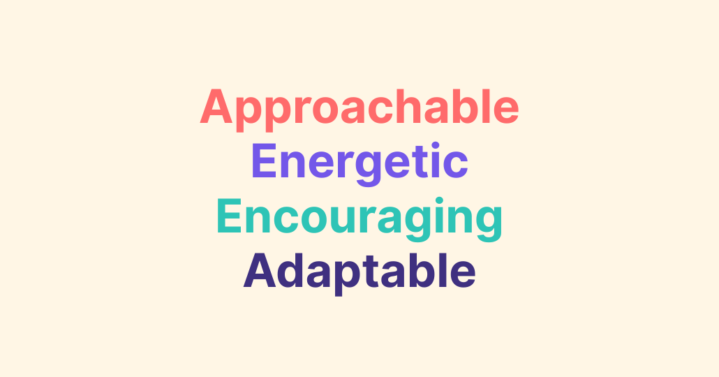
Our audience ranges from young professionals and growing families to financial coaches and small businesses—all seeking budgeting solutions that are clear, adaptable, and visually intuitive. Guided by our values—flexibility, clarity, empowerment, trust, and progress—we make finances feel approachable without sacrificing precision.
Tone & Voice
Our Vision: why we exist
To be the most adaptive budgeting tool in the market, making financial planning feel energizing instead of overwhelming.
Our Mission: what we do
To simplify and humanize budgeting through an intuitive, modular platform that evolves alongside its users.
Our Promise: how we help
We will always combine clarity with creativity—helping users adjust their budgets without losing sight of their goals.
Sample Copy
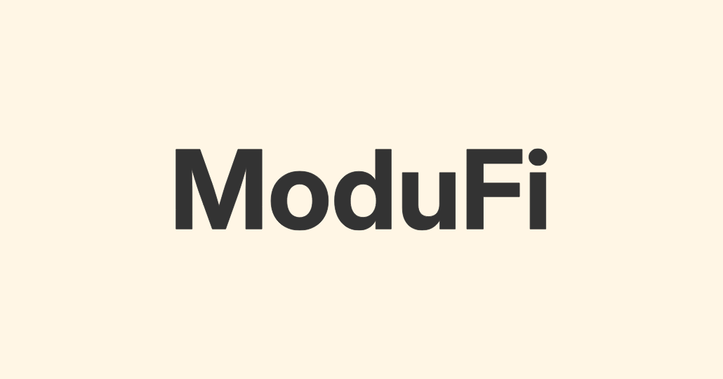
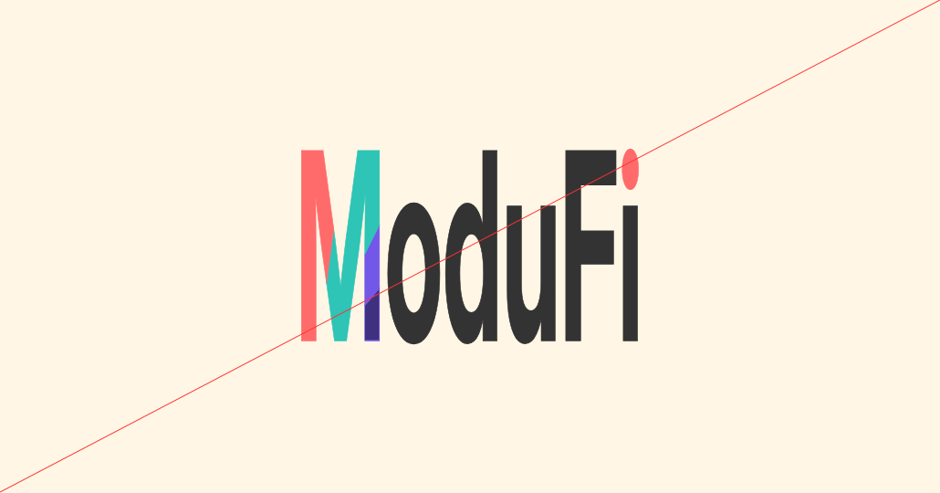
Primary Lockup
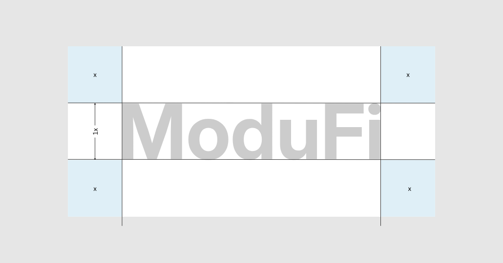
Clearspace
Secondary Lockups

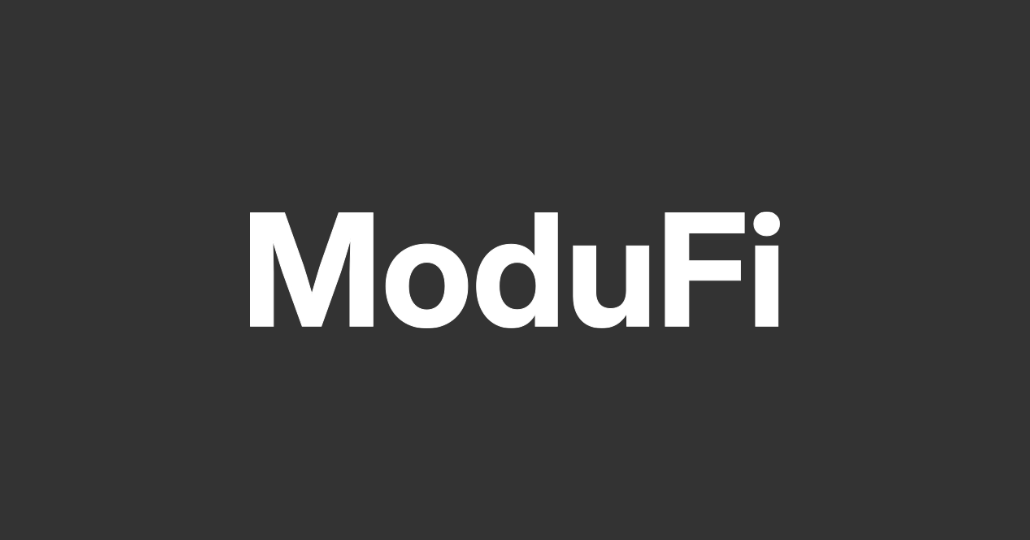
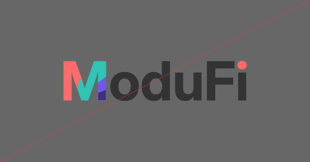
For dark backgrounds
For light backgrounds requiring monochromatic
For dark backgrounds requiring monochromatic
For small scale applications or under 50px height
Incorrect Usage
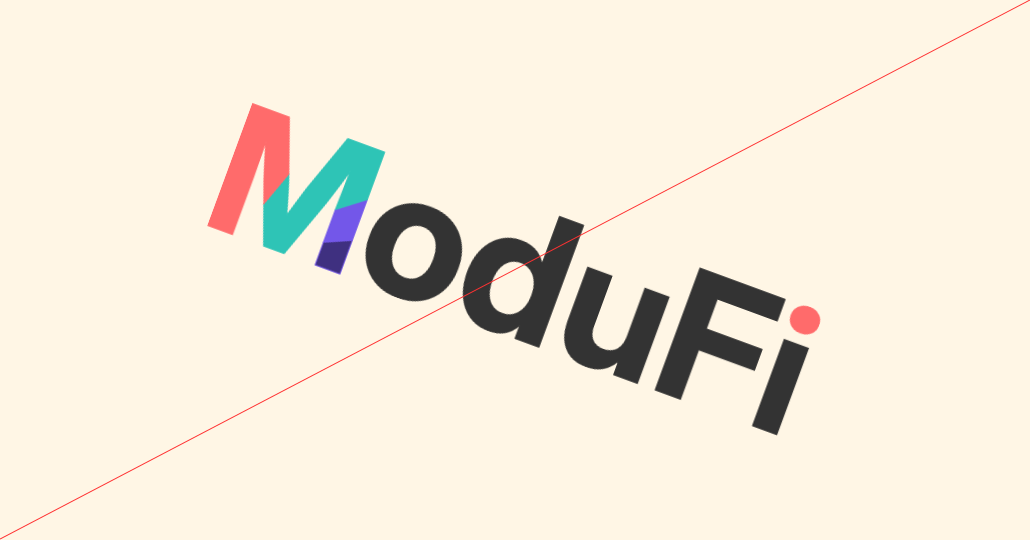

Do not rotate or tilt the logo
Do not distort or stretch the logo
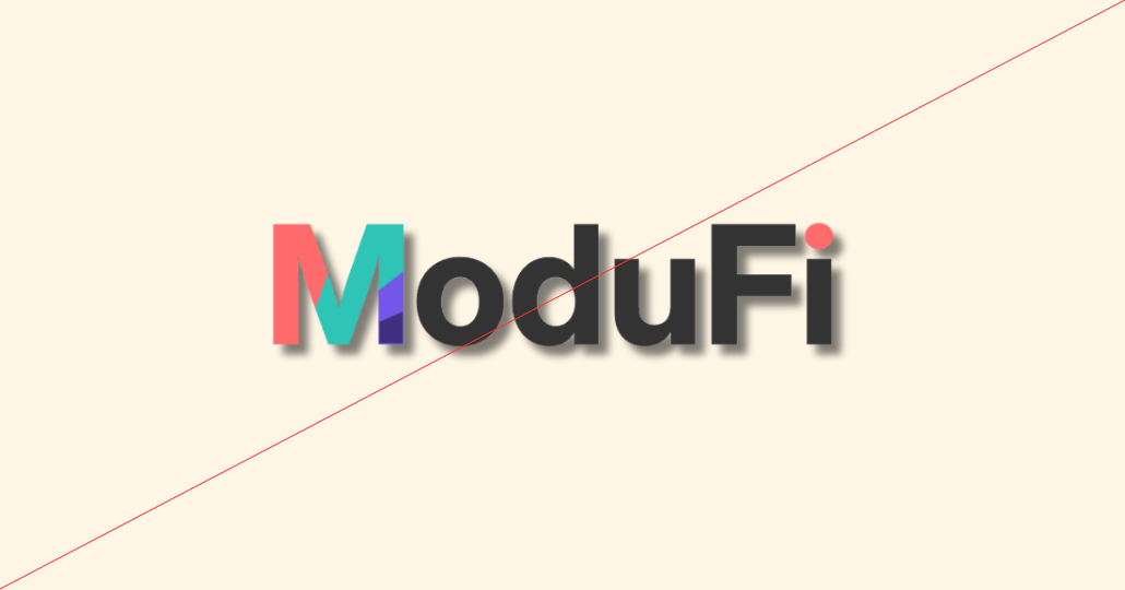
Do not apply drop shadows or unapproved effects
Do not place on backgrounds with low contrast
Do not change the proportions of the “M”
Do not change colours outside the brand palette
Primary Palette
Coral
Hex: #FF6B6B
Energetic and friendly—used for key highlights, action nudges, and emotional warmth.
Seafoam Teal
Hex: #2EC4B6
Fresh and adaptive— used for key highlights and UI emphasis.
Electric Purple
Hex: #7357E9
Bold and modern—ideal for standout data points, section headers, or hero elements.
Indigo
Hex: #3F3080
Deep and confident—used for primary typography, navigation, and anchoring the palette.
05 Typography
Typography in ModuFi is designed to balance financial clarity with approachable personality. Every font choice should make information easy to read at a glance while allowing room for moments of playfulness that reflect our modular, adaptive brand voice.
Primary Sans-Serif (Inter) is a versatile, modern typeface designed for maximum legibility across digital and print. Its clean, humanist letterforms convey clarity and approachability while maintaining the precision needed for data-rich environments. Perfect for dashboards, budgeting tools, and user interfaces, Inter ensures that even complex financial information is easy to scan and understand.
Optional Alternative Heading Fonts (Poppins or Sora) can be used selectively when a touch of personality or emphasis is needed—such as in campaigns, feature highlights, or brand-forward landing pages.
- Poppins offers a rounded, friendly, and geometric style that pairs naturally with Inter for a softer, lifestyle-oriented feel.
- Sora has a sharper, tech-forward look that works well for innovation-driven or product-specific contexts.
This pairing blends functional clarity with brand personality—modern yet approachable, precise yet inviting—ensuring ModuFi’s communication feels consistent, trustworthy, and engaging across every touchpoint.
06 Art Direction
ModuFi’s visual style is structured, modular, and approachable—rooted in the trust and precision of fintech, but energized by colour, shape, and movement. Every visual element should feel intentional, but never rigid, allowing our designs to adapt just like our budgeting philosophy.
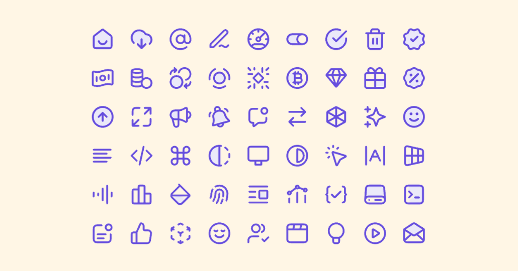
Iconography
Flat, minimal, duo-tone, and geometric with rounded corners for friendliness. Maintain consistent stroke weights and corner radii.

Photography
Real, diverse, and authentic moments—people engaging with finances in everyday life. Light and airy style. Avoid overly staged corporate stock photos.

Illustrations
Geometric, flat, and modular, with soft edges and a limited color palette aligned to brand colors.
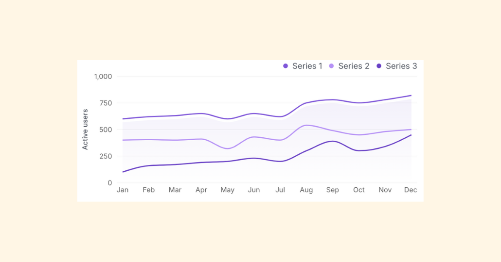
Data Visualization
Clean, high-contrast, and easy to interpret at a glance—use brand colours to highlight trends and key numbers.
Color Usage
- Lean on Coral for emotional impact and key CTAs.
- Use Seafoam Teal and Electric Purple to add vibrancy and guide the eye.
- Keep backgrounds clean with Vanilla Cream or white, layering in secondary colors for depth.
Tone of Visuals
- Optimistic: Use light, uplifting imagery and balanced compositions.
- Clear: Avoid visual clutter—every element should serve a purpose.
- Flexible: Layouts should adapt seamlessly across mobile, tablet, and desktop.
Movement & Animation
- Subtle micro-interactions—hover states, smooth transitions, and gentle scaling—should enhance usability, not distract.
- Animation should reflect modularity and adaptability, e.g., blocks rearranging, colors shifting softly.
Layout & Composition
- Grid-Based Foundation: Use a consistent grid to maintain alignment and hierarchy. Break the grid selectively to create moments of surprise or focus.
- Modular Blocks: Employ cards, stacked sections, and flexible containers to reflect our product’s adaptability.
- Generous White Space: Allow breathing room for content—especially in data-heavy interfaces—to reduce cognitive load.


